
Tuesday, May 31, 2011
For unto us
yep, another Christmas card, but I have to say, I love the simplicity of this one. I used this week's sketch challenge from Our Daily Bread Designs and if I don't finish all my cards before Christmas, this just might be the sketch I use for the rest of them. The papers are all DCWV, the sentiment is from Verve's "Richly Blessed". I layered up the focal panel; starting with Labels 4 (which I cut apart to get the right placement), then the sentiment layer, green layer with standard scalloped ovals large, and ended with the polka-dotted layer with a standard oval large cut out. Doing it this way just added something a little more fun than the traditional larger to smaller layering.
Monday, May 30, 2011
O Christmas Tree
The focal image of this card is recycled from a promo Christmas card I received last year. It was way to beautiful to throw away. I'm using the sketch from Stampin' Sisters In Christ. The theme this week was the unchanging nature of God so the twist on the challenge was to follow the sketch to a "T". I'm also entering the Christmas Stampin' All Year Long challenge to use a diecut as your focal image. I diecut mine using the labels 4 from spellbinders. I hand cut the snowflake for my circle element and I used the upper crest border punch from fiskars. The papers are all from DCWV.

Cracked Glass
This week's Make it Monday challenge (sponsored by papertreyink) was to use the cracked glass technique. My card uses the Pixie Cottage sketch challenge. I recycled a promo Christmas card from last year for the focal image. It was way too pretty to throw away! So, it was extremely low in the time factor. The papers are DCWV and the sentiment on the card front is from PTI's "Through the Trees". I embossed two lines over the sentiment using my scor-pal. The inside sentiment is from Verve's "Richly Blessed" and I added two birds from the "Through the Trees" set. I believe this makes 18 Christmas cards completed so far. Yippee!!


Thankful
This week, The Paper Variety challenge was to create something with a school theme. I don't know anyone graduating this year and my girls are not in school yet, but we do go to a weekly Storyhour which is a close to school as we get. : ) So, I made this thank you card for the lady that runs the storyhour. I thought the Winnie-the-Pooh reading stamp was just perfect! I used the Viva La Verve May week 5 sketch and used papers that matched the gift box I had all ready created (see the second photo). Luckily, the colors were perfect for the Pretty Palette #11 challenge to use white, daffodile, and marina mist (which I don't have). The sentiment is a combination of two stamps from Verve's "So amazing" (I think that's what it is called).


Word's Best Dad
 This is the inspiration photo for this week's Off The Wall Craftiness challenge to use blue, brown, and white on your paper creation. I made a box for my husband for Father's Day (don't know what I'll put in it yet) using the Creative Card Candy template from My Time Made Easy which fullfilled the Timeless Tuesday #119 challenge to create a bag or box and the JUGS #86 challenge to create a 3-D Father's Day project. I used the Pretty Pattern #11 sketch (from My Time Made Easy) for the top of my box. My husband is a carpenter, so this faux wood background (following this technique by Gina K) was perfect and I have been wanting to try it for a while. I used the Labels 5 and Labels 4 dies to create the frame around my sentiment which uses stamps from Verve's "World's Greatest".
 The "button" which you can see better in the second photo I created using aluminum tape embossed with cuttlebug's snowflake folder then die cut using PTI's Buttons #1 die. Unfortunately, the embossing flattened a bit doing it in this order, so I would cut then emboss if I did it again which I probably will. It created a really fun textured button.

Thursday, May 26, 2011
Heartfelt Sympathy
This week for Papertrey Ink's Make It Monday challenge, Nicole Heady challenged us to make sympathy cards. Hmmm . . . not something you usually have in your stash and I am acutally in need of a couple sympathy cards, so it was a perfect challenge. I used the Mojo Monday #191 sketch (last week's sketch but I did like it so I'm using it again). The two purple cardstocks are both from PTI; not sure what the names are, I got them in a sample pack. The sentiment panel was stamped with two stamps from PTI's Mat Stack 2 set on a labels 4 diecut by spellbinders. The flower is from Studio 112 (a dollar stamp I picked up at JoAnn's).

Try and try again
I was soooooooooo totally uninspired today when I started out. Ever have one of those days? I was trying to combine things that just weren't working. But then the mojo started flowing. I'm not positive I love this card anyway, but I do like it. Ha. Actually, I am pretty happy with it. I used the Pretty Palette #10 colors of ivory/green/burgundy/navy, the Delightful Challenges (sponsored by Digital Delights) challenge to use tags, the Skipping Stones Design #77 sketch, and the Stampin' Sisters in Christ Challenge to make an encouragment card using a touch of silver. I started out trying to make an easel card and ended up just making a funny front panel card, but hey, it's kind of fun as you can see in the second photo. The stamps on the card front are both from "Text Objects" by Verve and the inside sentiment is from SU! "Year Round Cheer II".


Sunday, May 22, 2011
Rainbow colors
The sketch for this card is the Viva La Verve May week 4 sketch challenge and I used this week's JUGS challenge to use red, orange, yellow, green, blue and purple. I think it was a challenge combo that I shouldn't have tried, but I did anyway. : ) I had to stretch the colors a bit since red was not going to match (but pink is a shade of red, right) and technically I didn't use orange, but the yellow and pink blending together do make orange. The brand image is from a new stamp set I just got from Rubbernecker Stamps. The dragonfly is from PTI's "Places Please" and the sentiment is from Verve's "Accent Notes" (I think, or it might be "Celebrating You")

Beautiful you
When I was making this card, I had a hard time deciding what color a butterfly "should" be. I think blue is a beautiful color for a butterfly. This is a new stamp set I just got from Rubbernecker stamps and I can't wait to try out all the options. The two butterflies and the branches are all from the same set. I colored the branch stamp with markers to get the two toned look and the butterflies are colored with colored pencils and then I used a glitter pen to highlight and add some shine. The sketch is Pretty Patterns #10 from My Time Made Easy and I am also using the Delightful Challenges challenge to use masking. I masked the large butterfly image to add the branch in the focal panel.

Enjoy your day
This card is a birthday card for my father-in-law. The stamp is from Clear Dollar Stamps and is one of my very few "manly" stamps which is what I needed for the Sweet Stop Challenge this week. It is a sketch with a twist: make it masculine. The papers are DCWV and the cardstock is SU!'s night of navy and brocade blue.

Happy Mice!
I have had this cute little mouse stamp for years and years and I don't think I have ever used it. What a shame. They really are adorable. Not a whole lot else to say about it. The papers are DCWV and there isn't anything else. I am entering it in the Christmas Stampin All Year Long challenge to make a vintage card, the Clearly Inspired Challenge (Clear Dollar stamps) to use critters and the Our Daily Bread Designs Challenge to use plaid or gingham.


Thursday, May 19, 2011
Last but not least.
This is another new challenge for me: Last but not least #4. Such a great title. : ) It is a once a month challenge, and they are pretty new themselves. This month it was a sketch challenge. If you have read other posts on my blog this week, you will recognize these papers, I have used them on several other cards. Hey, if it's all ready out, why not use it, right? My sentiment is from SU!'s "Versatile Verses" and the adorable log/fire image is from an awesome set from Clear Dollar Stamps: "Home Is Where The Heart Is" It's a whole set of pieces designed to make a fireplace scene. The grate, logs, and three sets of flames are all individual stamps. So cute! I used an oval and labels four nesties to frame the image. The snowflakes are MS and the border punch is Upper Crest by Fiskars. I also used a snowflake cuttlebug embossing folder on the base layer.

It's a tea party!!
Waltzingmouse is celebrating their 2nd birthday on Saturday and to celebrate, Claire is throwing a tea party. The challenge is to use either the freebie tea bag, teacup template or the piece of cake template. I chose to use the tea bag, which I dressed up a bit. I have a beautiful pansy tea cup that I used as the inspiration for the bag. The pansy stamp is from Clear Dollar Stamps (one of their retiring sets). I colored with colored pencils and it's a bit tough to tell, but I popped up two of the flowers and a leaf for a bit of dimension. I used a gold pen to outline the raised front panel that was diecut with a labels one nestie. I added a bit of a doily look with a fleur de lis border punch that I pieced across the top of the bag.

And check out this little tea tag!!! (it came with the template) Is it not THE cutest thing ever!!! So, happy birthday Waltzingmouse, celebrate in style!!
 So, happy birthday Waltzingmouse, celebrate in style!!
Wednesday, May 18, 2011
Hot Wheels
I have had this trans am stamp (from Clear Dollar stamps) for almost a year and had yet to ink it up. Acutally, I have been saving it to make a card for my father-in-law. He had two of these beauties a couple years ago, so as soon as I saw the stamp, I had to buy it. Now that Father's Day is coming up, I finally had a chance to use it. The sketch is from The Pixie Cottage and using stars is the challenge of the week from The Paper Variety. Papers are all DCWV and the stars are diecut with a sizzix die. The sentiment is from Verve's "Accent Notes."

A tough one!
Phew, this sketch from Skipping Stones Design was a tough one! What do you do with all the little squares around the perimeter??? Well, once I combined it with the Stampin Sisters In Christ #87 challenge to use a tea/coffee cup or pot, I had an idea. And I think I acutally like it. The dp is DCWV, I used a labels 4 die cut in half for the blocks and I used two old SU! stamps: the tea cup (got it as a doorprize a loooong time ago at an SU! party) and the sentiment is from Year Round Cheer (or something like that) which I have never really used because of it's size and it can be a little cheesy. I used real red, night of navy and creamy caramel inks all from SU!

Handmade Topiary
 The picture above is the inspiration photo from Off The Wall Craftiness. I forgot to add it in my original post.
 Look at that gorgeous inspiration picture for the Timeless Tuesday #118 challenge! The topiary was made by Julia Sandvoss who graciously gave them permission to use the picture.
I've always loved the look of topiaries and have played around in my mind with making one. So, today's card is a fulfillment of them thought on a miniscule scale. I made this one using a little tiny flower punch (I punched out about a zillion!) that I adhered to a die cut circle using scor-tape, and I added little white dots in the center of each using dimensional fabric paint. I am also using the Viva La Verve May week 3 sketch and the Off The Wall Craftiness challenge to use lime/seafoam/brown. The topiary paper was made using a new stamp set I just got from Clear Dollar stamps (it is one of their retiring sets: all the stamps needed to make a fireplace scene--I don't know what the name is).


Another Christmas card

Other than just trying to get ahead on my Christmas cards, I have found a challenge that makes it worthwhile to make Christmas cards: Christmas Stampin All Year Long challenges. This week the challenge was to use stitching; faux or real. I am also combining this with the JUGS challenge this weekd to use the technique kissing with a twist, the Our Daily Bread Designs challenge to use at least two die cuts, dry embossing and a sentiment and the Sweet Stop sketch challenge. My papers are both DCWV, I embossed the red layer with the snowflake cuttlebug embossing folder. I used labels 5 and labels 4 from spellbinders. The cross and sentiment are from Verve's "Richly Blessed" and the snowflake is from Inkadinkado. And I used black faux stitching around the base and red layers.
Tuesday, May 17, 2011
friend

This card uses the Pretty Palette 09 challenge to use white/black/pink and the Pretty Pattern 09 sketch challenge (both are from My Time Made Easy). I created the background pattern with Guide Lines 2 from PTI and "friend" is from Verve's "Text Objects". My pink looks a bit red, but it is rose red from SU! so I guess it is both red and pink. I'm using it as pink. : )
Pansies


I just got this new pansy stamp set from Clear Dollar stamps (it is on their retirement list, so it will be gone soon), isn't it gorgeous?! The pansy image, "pansy" sentiment and the background script are all from this set. Today, I'm playing along with the Pixie Cottage sketch and/or tag you're it challenge and the Delightful Challenges (by digital delights) challenge to use flowers on your card.
Thursday, May 12, 2011
Get our sketch on
It's day two of Flourishes release week challenges. Today's challenge is a sketch.
 The sentiment and text are from Verve's "Text Objects", the medallion is from PTI's "Guide Lines 2, Happy Anniversary is from PTI's "Damask Designs and the flower is a $1 treasure from Studio 112 (bought it at Michael's I think).

 The sentiment and text are from Verve's "Text Objects", the medallion is from PTI's "Guide Lines 2, Happy Anniversary is from PTI's "Damask Designs and the flower is a $1 treasure from Studio 112 (bought it at Michael's I think).
Wednesday, May 11, 2011
3 in a row

This is release week for Flourishes and today's challenge is to use any (but only one) row in the grid above. I went with the 3rd column: scallop, ribon, pearl. I wasn't going to do any stamping this week because I have a jewelry selling event on Saturday and REALLY need to make some more jewelry. BUT who can resist the chance to win free (new release) stamps from Flourishes!?! And that's what the prize is this week. So, I had to get a little inky. : ) I used a scalloped border punch from Martha Stewart and embossed two lines above it using my scor-pal. I embossed the main panel with a cuttlebug embossing folder. Die cut a labels 4 (spellbinders) and embossed the sentiment from Verve's Text Objects with silver embossing powder. Added two pearls and a peg bow (see this tutorial from Becca Feeken) with another pearl in the center. The inside uses a sentiment from SU!'s Versatile Verses and the "congratualtions" is from a wedding set I picked up at Michael's.

 The inside uses a sentiment from SU!'s Versatile Verses and the "congratualtions" is from a wedding set I picked up at Michael's.
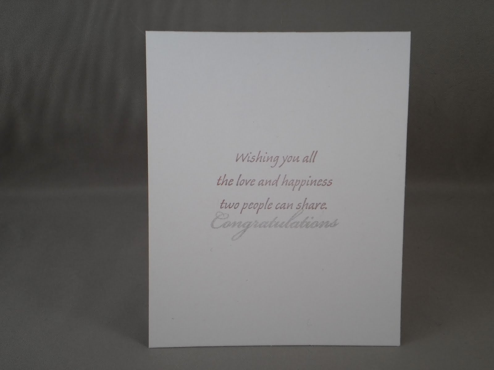
Tuesday, May 10, 2011
Joy
This card uses the JUGS #83 sketch challenge for this week. I just could NOT do that odd shaped layer in the upper left corner, so I went with a circle instead. Another Christmas card made and a few items used up off my work table, yeay! The sentiment is from a Christmas set by Inkadinkado, the paisley paper is from a Christmas stack by DCWV, and I used a labels 5 and a classic circles large nestie dies and a Martha Stewart snowflake punch. Oh yeah, and the snowflake embossing folder by cuttlebug.

Where there is Love . . .
I hope everyone is enjoying some nice weather now that spring has finally arrived. I don't know what you do when the weather turns warm, but I bet it's not what my girls do!! The littlest one is not quite as bad, she decided sliding on the slide was more fun. Just thought I would share in case you needed a little smile (or an "eeww, gross").

I would much rather make cards than play in the mud! : ) This card uses the Viva La Verve May week 2 sketch, the Pretty Palette #8 (My Time Made Easy) of ivory/rose/celery, the Our Daily Bread Designs challenge to use embedded embossing, and the Timeless Tuesday #117 (Flourishes) Anything Goes challenge. My rose paper is rose red from SU! which I stamped with the same ink using a flower jumbo wheel stamp. After I stamped the main panel and adhered the green borders (made using the Upper Crest punch from fiskars) and adhered it to the card base, I embossed it with a damask cuttlebug folder to get the "embedded embossed" look. It's a bit hard to see in the pictures, but it is really cool in real life. I used a labels 4 die (stamped with a french script stamp in versamark) and scalloped tag die by spellbinders for the focal image. The sentiment and two hearts are from Text Objects by Verve.


I would much rather make cards than play in the mud! : ) This card uses the Viva La Verve May week 2 sketch, the Pretty Palette #8 (My Time Made Easy) of ivory/rose/celery, the Our Daily Bread Designs challenge to use embedded embossing, and the Timeless Tuesday #117 (Flourishes) Anything Goes challenge. My rose paper is rose red from SU! which I stamped with the same ink using a flower jumbo wheel stamp. After I stamped the main panel and adhered the green borders (made using the Upper Crest punch from fiskars) and adhered it to the card base, I embossed it with a damask cuttlebug folder to get the "embedded embossed" look. It's a bit hard to see in the pictures, but it is really cool in real life. I used a labels 4 die (stamped with a french script stamp in versamark) and scalloped tag die by spellbinders for the focal image. The sentiment and two hearts are from Text Objects by Verve.

Seaside birthday
If you have never checked out the blog of Michelle Zindorf, you should. The woman is a genius when it comes to building scenes with ink! In my card today I sort of combined two of her tutorials (here and here) to create this beach-themed card for my husband's grandfather. (We live in Rhode Island so it is extremely fitting.) I'm not nearly as good at using a brayer as Michelle (must need more practice) so I ended up sponging in some of my ink. And I don't have many ink colors, so I used creamy caramel for the sand and tempting turqoise and night of navy for the water (all by SU!). The card uses the Pretty Patterns #8 sketch (My Time Made Easy), the Pixie Cottage Challenge #68 to use either their sketch or make one for the boys, the Clearly Inspired Challenge #27 (Clear Dollar Stamps--who is having a fabulous retirement sale by the way) to use turquoise, and the Make It Monday (Papertrey Ink) challenge to use selective inking.  The card is pretty self explanatory. The papers are from DCWV (check out the sand that makes up the background), the shell stamps are from a wheel (have not used one of those in a long time) that I "selectively" inked and the sentiment (both parts on the front and the longer part inside) is from PTI's Big Birthday Wishes that I also "selectively" inked. And the tag was made from a labels 4 die by spellbinders.

 The card is pretty self explanatory. The papers are from DCWV (check out the sand that makes up the background), the shell stamps are from a wheel (have not used one of those in a long time) that I "selectively" inked and the sentiment (both parts on the front and the longer part inside) is from PTI's Big Birthday Wishes that I also "selectively" inked. And the tag was made from a labels 4 die by spellbinders.
Tuesday, May 3, 2011
Happy11th Birthday

This card uses the Viva La Verve May week 1 sketch challenge, the Off The Wall Craftiness colorc challenge of orange/yellow/navy (check out the inspiration photo above), and the Timeless Tuesday #116 challenge which was to create a card for a child (anyone under the age 13). I used a lot of Papertrey Ink products on this: Guide Lines 2 which I used to create the polka dotted dp (colored in the circles with colored pencils), By The Numbers dies to create the #11, and their new birthday set (can't remember the name) for the sentiments and "th". The navy cs, ribbon, and ink are from SU! and I used classic ovals large and labels one dies from spellbinders.

Mother's Day take 2
When you are married, you don't have just one mother but two! And thus, you need two Mother's Day cards. If you read my previous post, you will notice that this one has most of the same elements. Yes, I made the dp all at the same time and used the same color scheme: pink, light gray, and burgundy which are the Pretty Palette (My Time Made Easy)challenge colors for this week. I also used the Mojo Monday #189 sketch challenge. The dp was made with Guide Lines 2 from PTI and a French script stamp. The sentiment is from Sweet n' Sassy stamps and the flower is from Inkadinkado and I used Labels 4 for the focal image.

Mother's Day
Mother's Day almost snuck up on me. I "knew" it was the first weekend of May, but for some reason kept thinking it was the 14th. So, I was going to take this week off from making cards until I realized I needed Mother's Day cards. The sketch is the Pretty Patterns #7 (from My Time Made Easy). And I used the JUGS #82 challenge which was to use the emboss resist technique. I am also entering it in the Skipping Stones Designs challenge. It is a free for all this week since they are in between guess designers. I made my own dp with Guide Lines 2 from PTI and a French script stamp. The sentiment is from Sweet n' Sassy stamps.

Subscribe to:
Posts (Atom)